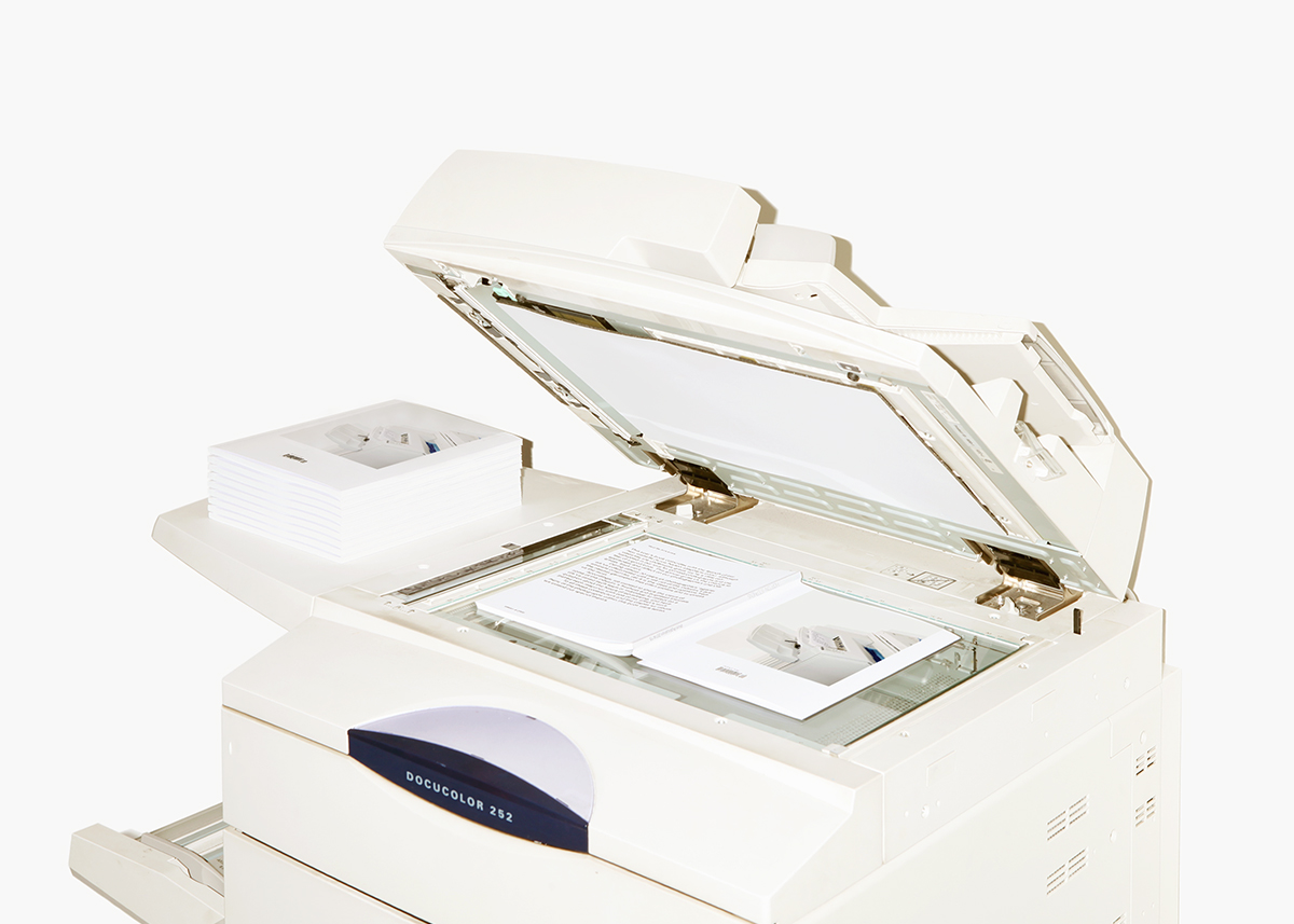
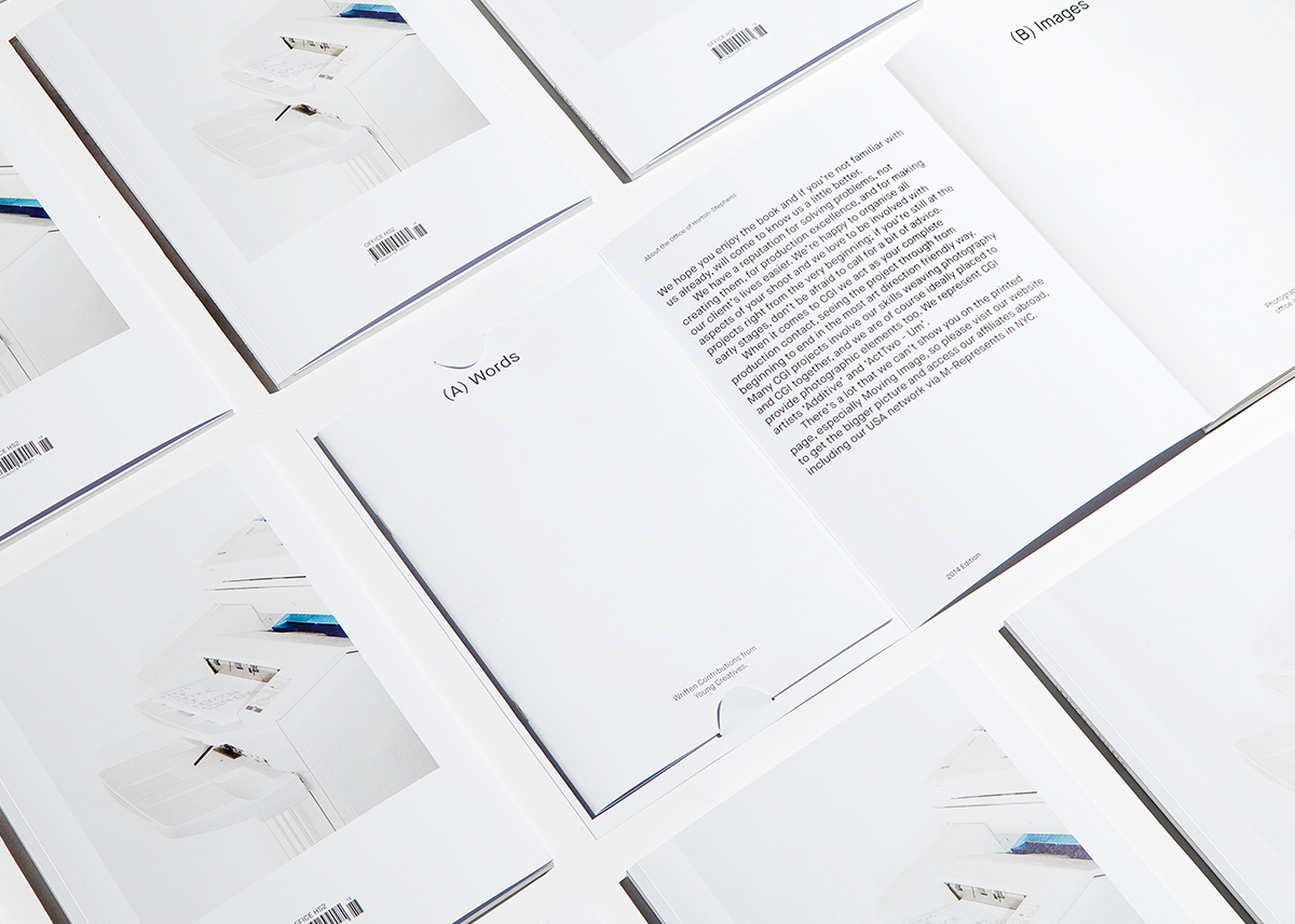
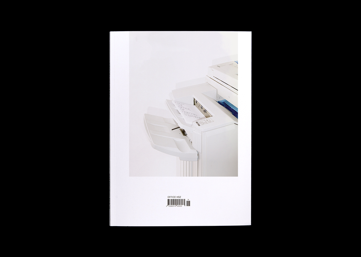
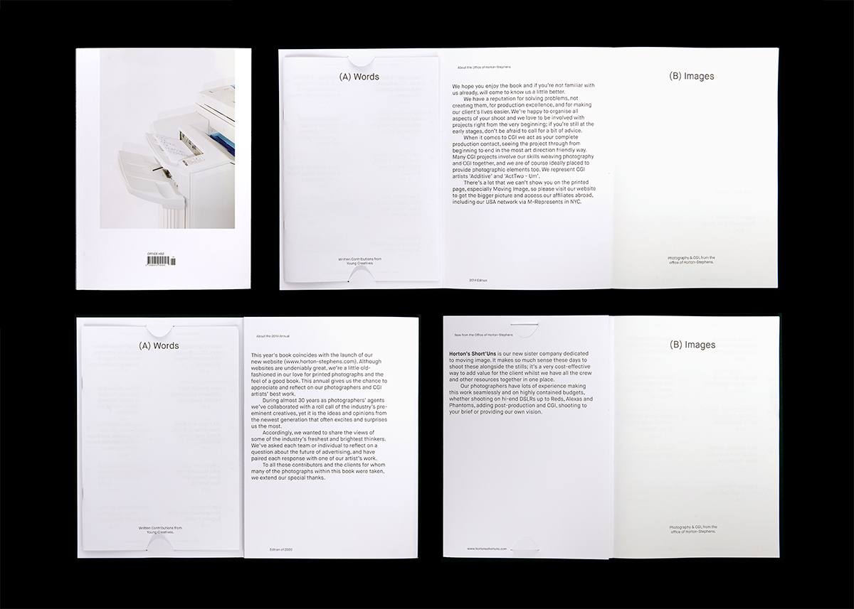
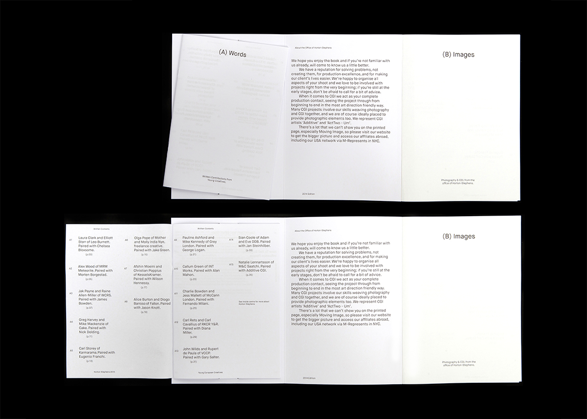
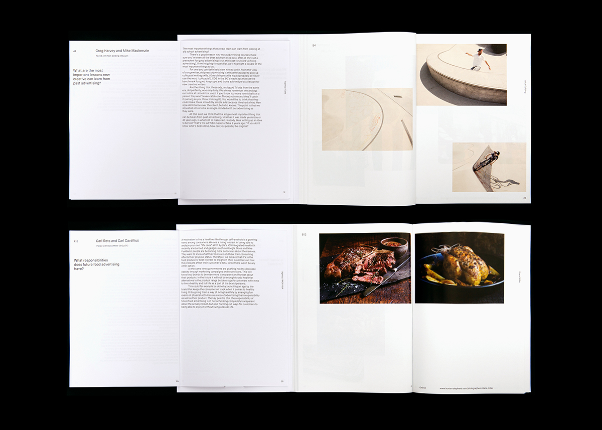
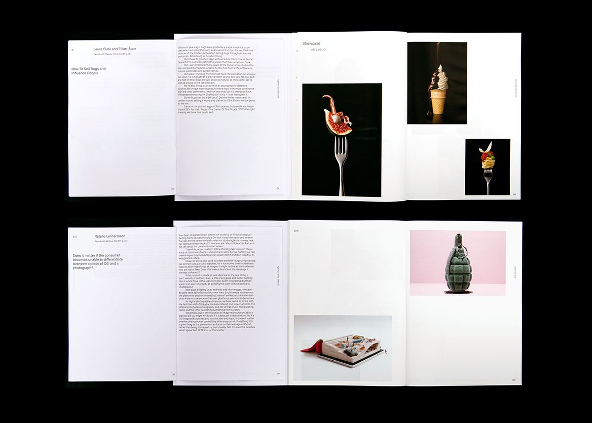
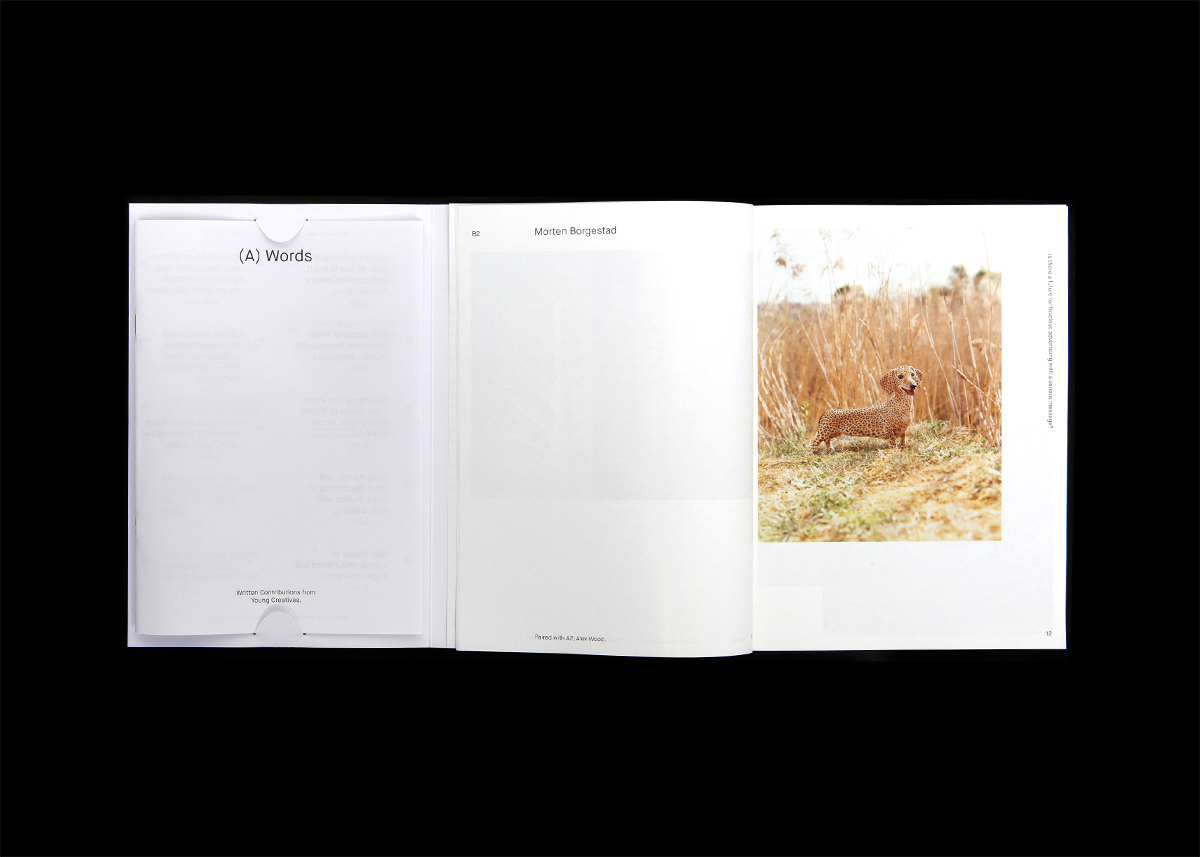
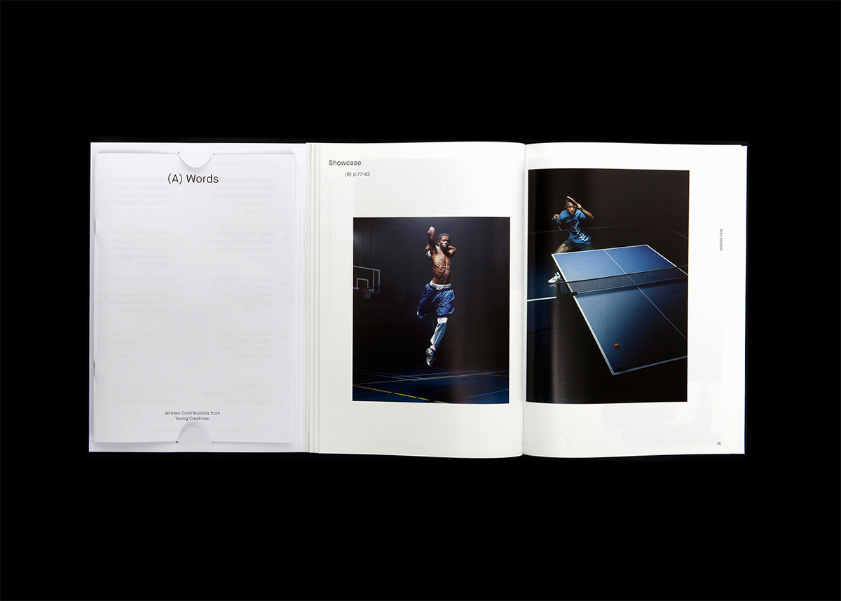
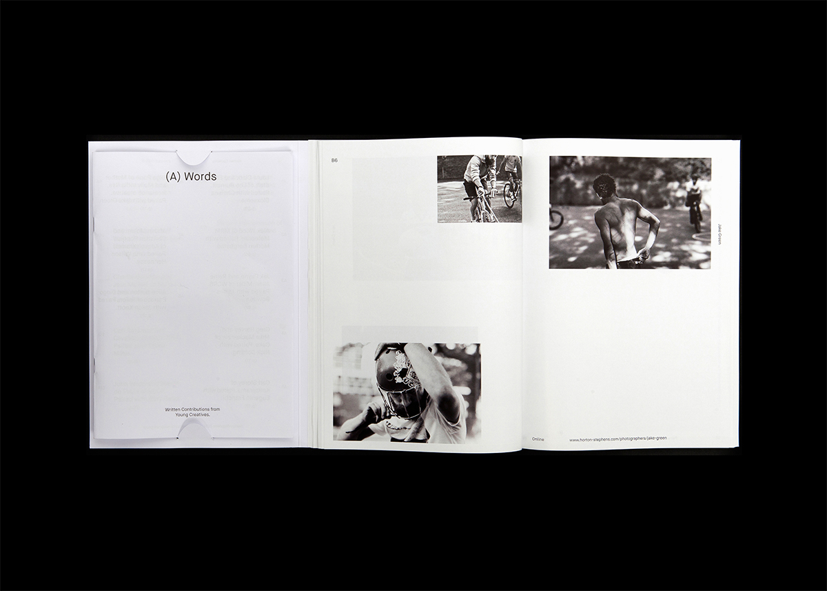
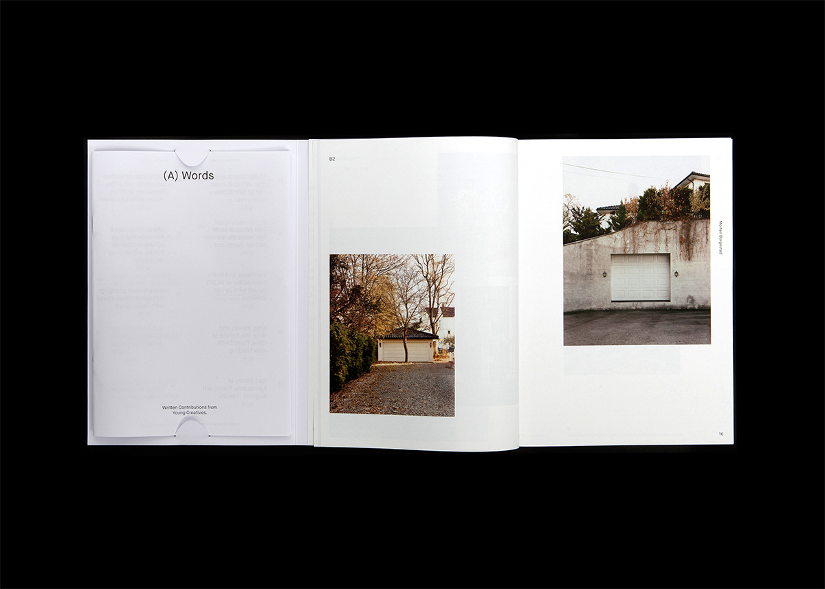
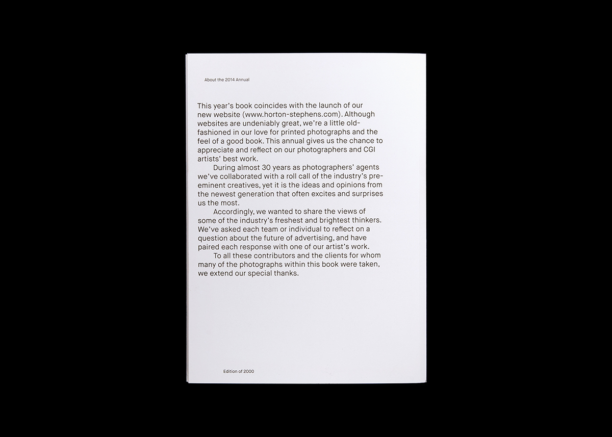
Commissioned to design the Horton-Stephens' 2014/15 Annual; a publication which showcases the latest images from the photographers Horton-Stephens represent. Similar to last year, these images were paired with written responses. This year our responses were focused upon the future of the advertising industry and came from a new generation of young creatives from leading agencies and studios across Europe.
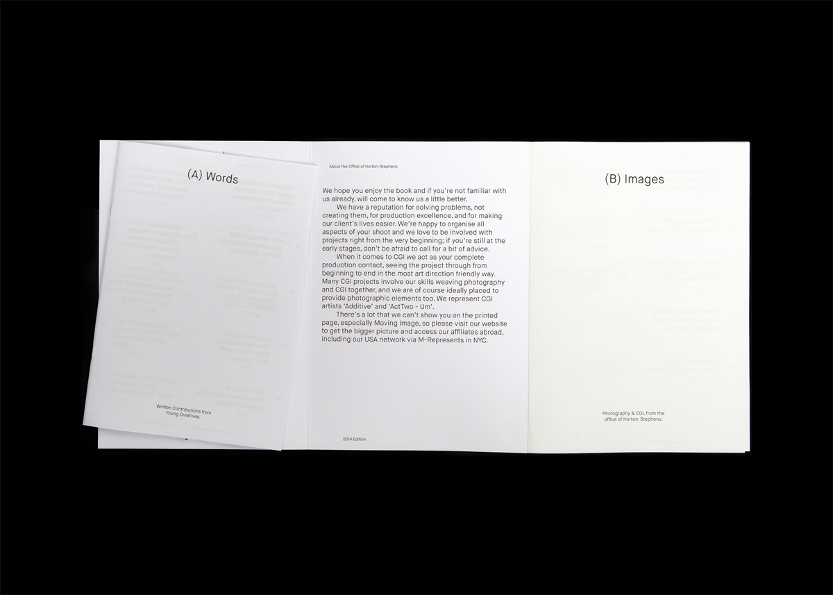
The design of the publication itself, deliberately divided images from words in order to give equal weight to both; with a simple cross referencing system in place to allow readers to pair contributions. A basic uncoated and gloss 'copy-stock' was also chosen to reflect the annual's front cover.
Featured on It's Nice that.

